
How to Communicate the Benefits of Non-Traditional Modeling Techniques for Insurance Pricing
A look at new explanatory tools that better communicate the predictive and interpretative power of new analytics models.
Actuaries build models to analyze historical loss frequency and severity data to properly determine the price of a risk. Understanding how those models function helps an actuary understand when the model works as it should, and those occasions when it does not.
Most states impose regulations on insurance rates to ensure that rates are not inadequate, not excessive, and not unfairly discriminatory. If rates are based on models, the outputs of models in these states must be explainable, so that regulators in the insurance industry can be sure that rates are not unfairly discriminatory.
One of those models is the generalized linear model, or GLM. GLMs are a popular linear regression because they offer a high level of interpretability and predictability and allow more flexibility through the selection of a link function to the target (e.g., frequency or severity).
The advancement of computing power from cloud computing and open-source communities, however, has brought forth the ability to build models with even more predictive power. In general, machine-learning models, including tree-based models such as random forests and gradient boosting techniques, have shown better predictive power than traditional GLMs.
Although machine-learning models may have better predictive power, they are generally much less interpretable than traditional GLMs, due to a “black box” nature. Therefore, we have seen that most insurance companies are continuing to use simple linear models as opposed to complex non-linear models.
But what if we can increase the interpretability of complex models? That, combined with their superior predictive power, could conceivably make these newer models even more useful than traditional GLMs.
In fact, the machine-learning community has developed feature importance metrics to help better understand and interpret non-linear models. By performing these feature importance tests, an actuary can decipher the importance of a certain feature in the model.
The open-source software Python has a package containing feature importance tools that can be used to explain different non-linear models. The feature importance plot is useful but contains no information beyond importance. Therefore, to improve the “explainability” of models and to explain individual predictions, two approaches have become popular among the machine learning community:
- Local Interpretable Model Agnostic Explanations (LIME)
- SHAPLEY Additive Explanations (SHAP)
LIME is a technique that approximates any black box machine-learning model with a local, interpretable model to explain each individual prediction.
SHAP, on the other hand, is a game theory approach. This helps to interpret machine-learning models with Shapely values – measures of the contribution each feature has in a machine-learning model.
To compare interpretability between GLMs and complex models, I developed a loss cost model from a publicly available dataset (Figure 1) and used both a GLM and a complex model to predict losses.
The dataset contained 67,856 policies, of which 4,624 filed claims.
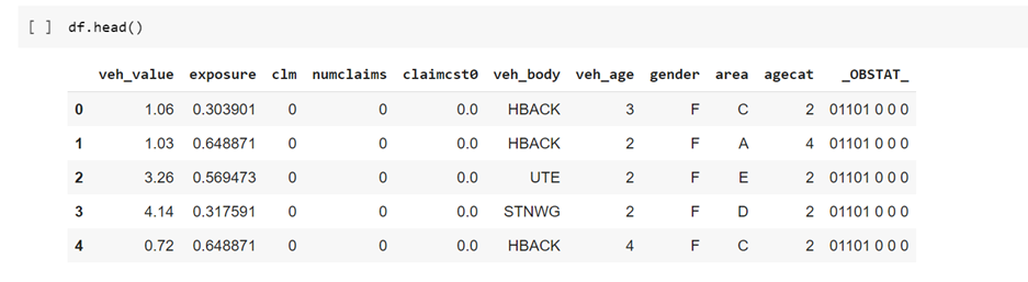
For the model, I used claim costs as the response variable and exposure as the offset, using a type of GLM with a Tweedie distribution – the best fit for this data.
Using the Tweedie GLM to predict losses, I produced the table in Figure 2, which shows various “goodness-of-fit” metrics for the model. It enables an actuary to determine the amount each variable contributes to the prediction for any given observation by examining model coefficients.
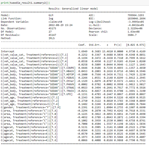
The GLM results in Figure 2 demonstrate how important the variables are in predicting the model results, based on the magnitude of their coefficients.
For example, in this GLM, we obtain the exponential of the coefficient value for a vehicle with the body of a Coupe (COUPE). As indicated in Figure 2, that value is higher than that of the exponential of the coefficient value for a station wagon (“STNWG”). That simply tells us that you would expect a higher loss from a Coupe. This is fairly straightforward and explainable to a regulator.
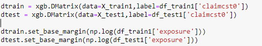
Next, I attempted to use a more complex model to predict the claim costs from the data. In this example, I used the XGBoost model. XGBoost is a decision-tree-based ensemble machine-learning algorithm that uses a gradient-boosting framework. I created a data matrix, which is required for this algorithm, and applied the offset in this model.
After evaluating the GLM model and the XGBoost model, I found that the XGBoost model performs better on metrics such as the root-mean-squared error, a standard way to measure the error of a model.
This was great news – I found a model with better predictive ability than the GLM! But could the results be explained to a regulator?
Simply showing a feature importance plot for all the observations wouldn’t provide enough information about why a specific policyholder might be charged more or less than others. To explain that, let’s look more closely at the XGBoost model results using the SHAP values.
The SHAP library in Python gives a summary explanation of the key features in the model results, as shown in Figure 4, a feature importance plot for the entire dataset:
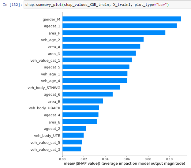
This plot illustrates which features are more dominant for the overall model, but it cannot explain the variable importance for each individual policy holder.
To acquire a policy-level understanding, the SHAP library also explains individual predictions, which can be more important.
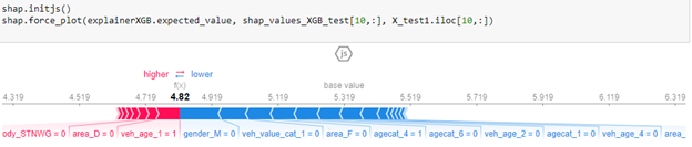
In Figure 5, the base value, or the average of all predictions, is 5.319. However, this individual prediction has a value of 4.82. The blue arrows indicate which features are pushing the value towards the negative and by how much. The red indicate which values are pushing the value more towards the positive and by how much. For this policy, the “gender_M” and the “veh_value_cat_1” are the major contributors pushing the particular policy to a value less than the base value.
This indicates explicitly that there are certainly instances when we can utilize SHAP values to effectively explain why the price of a particular policyholder is higher or lower based on their policy features.
To summarize, machine-learning, open-source computing and other new technologies have delivered increased computing power for actuaries, data scientists and analysts. That increased power to has meant better performing models for determining insurance pricing.
But there is a curve to adoption of innovation. The curve of usage of new complex analytical models seems to be slow, because of the perception they are black boxes. We can accelerate their usage, however, with better explanation of their benefits. And for explanatory tools such as LIME and SHAP, the benefits are indeed demonstrable.
Tools such as SHAP will help actuaries better explain results to regulators and help explain why a certain policyholder is charged a particular price. Importantly, for their bottom line, SHAP and other machine-learning models can mean more appropriate and better policy pricing. That’s a benefit that is surely easy to communicate.
Erool Palipane is a data scientist II with Pinnacle Actuarial Resources in the Bloomington, Illinois, office. He has a Ph.D. in atmospheric science from George Mason University in Virginia. Erool has experience in assignments involving predictive analytics.
News & Insights

Closing the Protection Gap: Innovative Risk Transfer Solutions for Emerging Risks

Nick Gurgone Named One of this Year's Forty Under 40 by Captive Review

One Vision, Two Disciplines: The Partnership Keys to Captive Success
